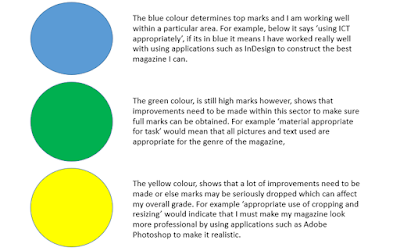
 After spending weeks constructing my magazine on InDesign, I finally had my 'finished product'. I handed this in for feedback from my class friends, and from this I could make the touches I needed to make sure my magazine was perfect. The first two images below show how I had practised marking work. The colour strips of paper indicate how well I did within a certain sector. After practising I moved onto my work, I know knew what to do to improve my magazine and make it look just like a real life one.
Sunday, 28 February 2016
Target Audience Feedback
 After spending weeks constructing my magazine on InDesign, I finally had my 'finished product'. I handed this in for feedback from my class friends, and from this I could make the touches I needed to make sure my magazine was perfect. The first two images below show how I had practised marking work. The colour strips of paper indicate how well I did within a certain sector. After practising I moved onto my work, I know knew what to do to improve my magazine and make it look just like a real life one.
Wednesday, 10 February 2016
Construction of My Magazine
During the process of making my magazine I took many pictures (as seen by the long list below) and I had to closely photo shop this to be able to place them in my magazine and make it look professional. It took a long time and experimentation to make my magazine, but once I had the right structure and idea, it became easier to make. The colour scheme was my biggest challenge. I didn't want to put the same colour together too much or have really bright colours with my black, white and red scheme.
Never the less, below is a little of my work and how many files I had to complete my work in the end.
Friday, 5 February 2016
Feature Article Plan
 Like my last post, I have also made a plan for my feature article. I have not yet decided whether I want a four page spread of my cover star or a two page spread. This will all depend on how well I manage my time and understand the process of InDesign. Never the less, I made a plan on the two page spread as this will be my main focus if I don't do four pages.
From this picture, on the left side will be the conventional full page picture of my cover star and following this, on the right page will be an article, consisting of again the conventional three columns. The cover star will not be using direct address within this picture as I want the real 'photo shoot' perspective, as usually the paparazzi are the ones who are writing articles on celebrities, and I want this visual within my magazine as well.
Beneath is also another Prezi presentation I made to show the process of planning my music magazine feature article.
Subscribe to:
Posts (Atom)